Introduction to Data Visualization: Coding Guide
Josh Carrell - Utah State University, MS Ecology
Last Update: May 13, 2022
Data Visualization
Knowing how to find data, clean data, and analyze data are extremely important. However, being able to communicate your results to a wide range of audience can be most important. No one can resist a beautiful map or graph and people are largely visual creatures. We use our eyes to quickly make decisions and an ugly or boring data visualization can break an entire presentation. Lastly, data visualization is just really fun.
We’re going to dive into the following packages:
ggplot2. ggplot2 is one of the most used packages for graphing and data visualization.
That’s it. Just ggplot2 today. We will move into other data visualization packages for spatial data in week.
NOTE: Data visualization in R is really excellent. The code and examples here are fairly simple and serve only as a foundation for getting to know ggplot2. To really get your hands on some crazy excellent visualizations, it’ll take a little more time and practice. To learn more: GOOGLE data visualization in R or ggplot2 visualizations in R. There are so many examples!
ggplot2
“ggplot2 is a system for declaratively creating graphics, based on The Grammar of Graphics. You provide the data, tell ggplot2 how to map variables to aesthetics, what graphical primitives to use, and it takes care of the details.” - https://ggplot2.tidyverse.org/
You can install the package ggplot2 or you can just load the tidyverse package which will load it for you.
Let’s get started.
Basic syntax and formatting
ggplot()
ggplot2’s central function is ggplot(). Within this function you will direct the function to a specific dataset and set the foundation for what type of plot/graph you want to create.
For example, Let’s say we want to use the iris dataset (I know, I’m sure you’re sick of it by now!). We will set up our code as such:
ggplot(data = iris) or ggplot(iris).
aes()
aes() is the next function you need to know when using ggplot(). It stands for Construct Aesthetic Mappings. Basically, aes() tells the ggplot() function what specifically within our data that we want to be the x axis and y axis. We can also direct ggplot() through the aes() function to give our graph color by using col =.
Let’s say we want to create a scatterplot and have sepal length be our x axis and sepal width our y axis. We would also like the points on our scatterplot to be colored by species. The code would be set up as such:
ggplot(iris, aes(x = Sepal.Length, y = Sepal.Width, col = Species))
Plotting
geom_point()
The great thing about ggplot() is that you can set up your code with a specific design in mind (see above) and then add what type of graph you want. We set up our code to be a scatterplot but that same design could also be a line plot, density plot, or heat map plot (we will learn these soon).
But we wanted a scatterplot. Right now, our code above is formatted correctly, but ggplot() doesn’t know that. It needs one more step of direction.
Introducing geom_point(). geom_point() will now add the points that we would be anticipating with scatterplot. To create the scatterplot, our code will be set up like this:
ggplot(iris, aes(x = Sepal.Length, y = Sepal.Width, col = Species)) + # set up ggplot format
geom_point() # specify ggplot action
Let’s run it.
ggplot(iris, aes(x = Sepal.Length, y = Sepal.Width, col = Species)) +
  geom_point()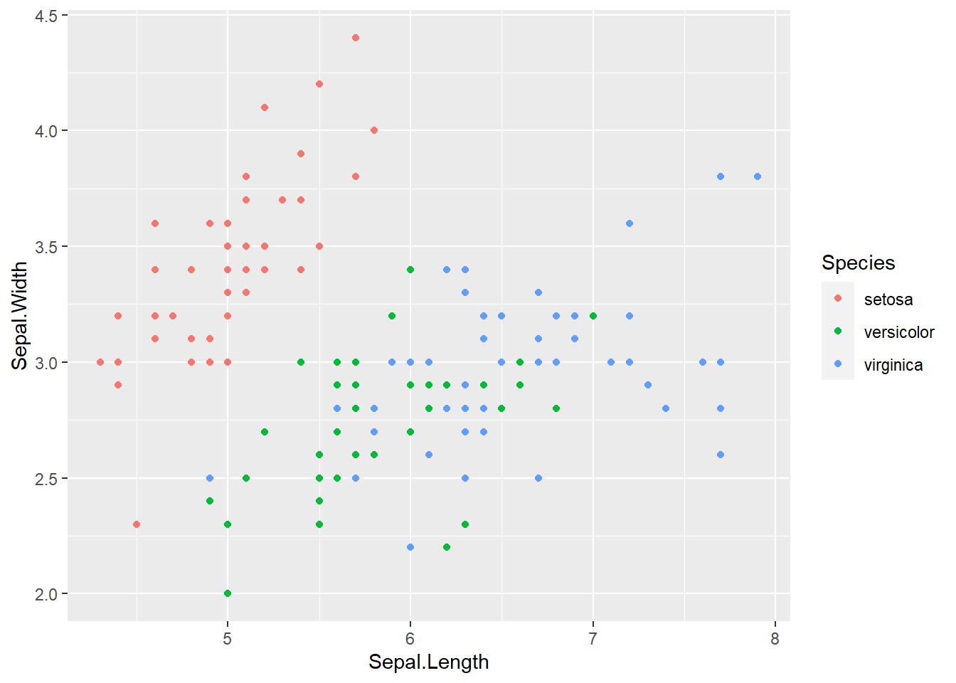
Not a bad looking graph. Much better than just black and white. But there are still a couple of aesthetics to work out.
labs()
First, look at the labels on the x and y axis. The labels will be identical to whatever the column name of your specified data for that axis. Sepal.Length and Sepal.Width are correct but we don’t need those periods in there. The legend title is pretty good, but we got lucky as it was named correctly.
By adding the function labs() to our code, we can change the names of those labels quite simply. We can even give it a title and subtitle.
Let’s say we want to remove the periods on the axes, give the plot a title, and remove Species above the legend. Our code would look like this:
ggplot(iris, aes(x = Sepal.Length, y = Sepal.Width, col = Species)) + # set up format
geom_point() + # specify ggplot action
labs(main = “Sepal Length vs. Sepal Width of Iris Species”, # add a title
x = “Length”, y = “Width”, col = ““) # add a new title for x and y axis, remove Species from legend
Let’s give it a run.
ggplot(iris, aes(x = Sepal.Length, y = Sepal.Width, col = Species)) +
  geom_point() +
  labs(title = "Sepal Length vs. Sepal Width of Iris Species", x = "Length", y = "Width", col = "")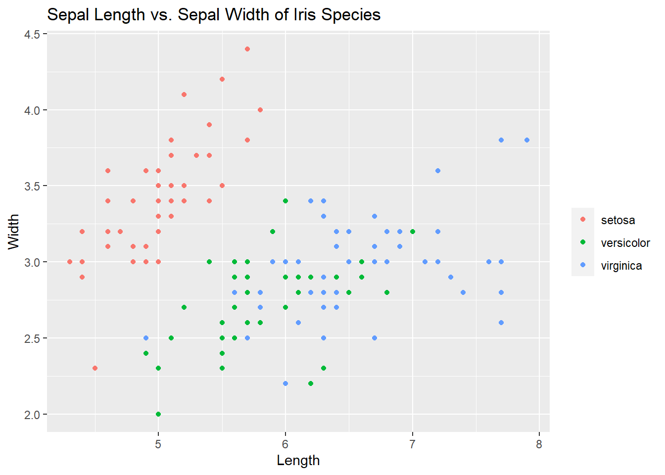
Things are starting to come together here. But there is more!
ggplot themes
The default ggplot() has a grey tiled grid surrounded by a white background. There are ways to change this by using a theme.
To see the themes you can use, start typing the word “theme” in your console. You should see many ggplot themes to choose from. Let’s run the same code above but switch the theme to theme_bw(). There are a lot of options to choose from!
ggplot(iris, aes(x = Sepal.Length, y = Sepal.Width, col = Species)) +
  geom_point() +
  labs(title = "Sepal Length vs. Sepal Width of Iris Species", x = "Length", y = "Width", col = "") +
  theme_bw()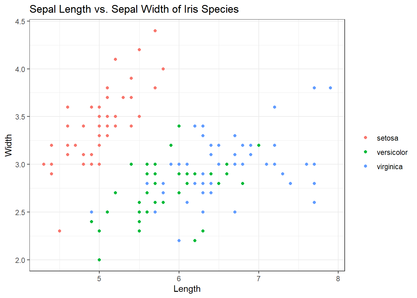
Excellent. Now that we’ve covered the basics of organizing a ggplot, let’s get back to different ggplot graphing functions.
geom_smooth()
geom_smooth() aids the eye in seeing patterns in the presence of overplotting. If we add a geom_smooth() to the plot above, it will help us see the correlations between sepal length and width for each species. Best way to understand is to see it. Check out the code and plot:
ggplot(iris, aes(x = Sepal.Length, y = Sepal.Width, col = Species)) +
  geom_point() +
  geom_smooth() +  # Adding in the smooth
  labs(title = "Sepal Length vs. Sepal Width of Iris Species", x = "Length", y = "Width", col = "") +
  theme_bw()
## `geom_smooth()` using method = 'loess' and formula 'y ~ x'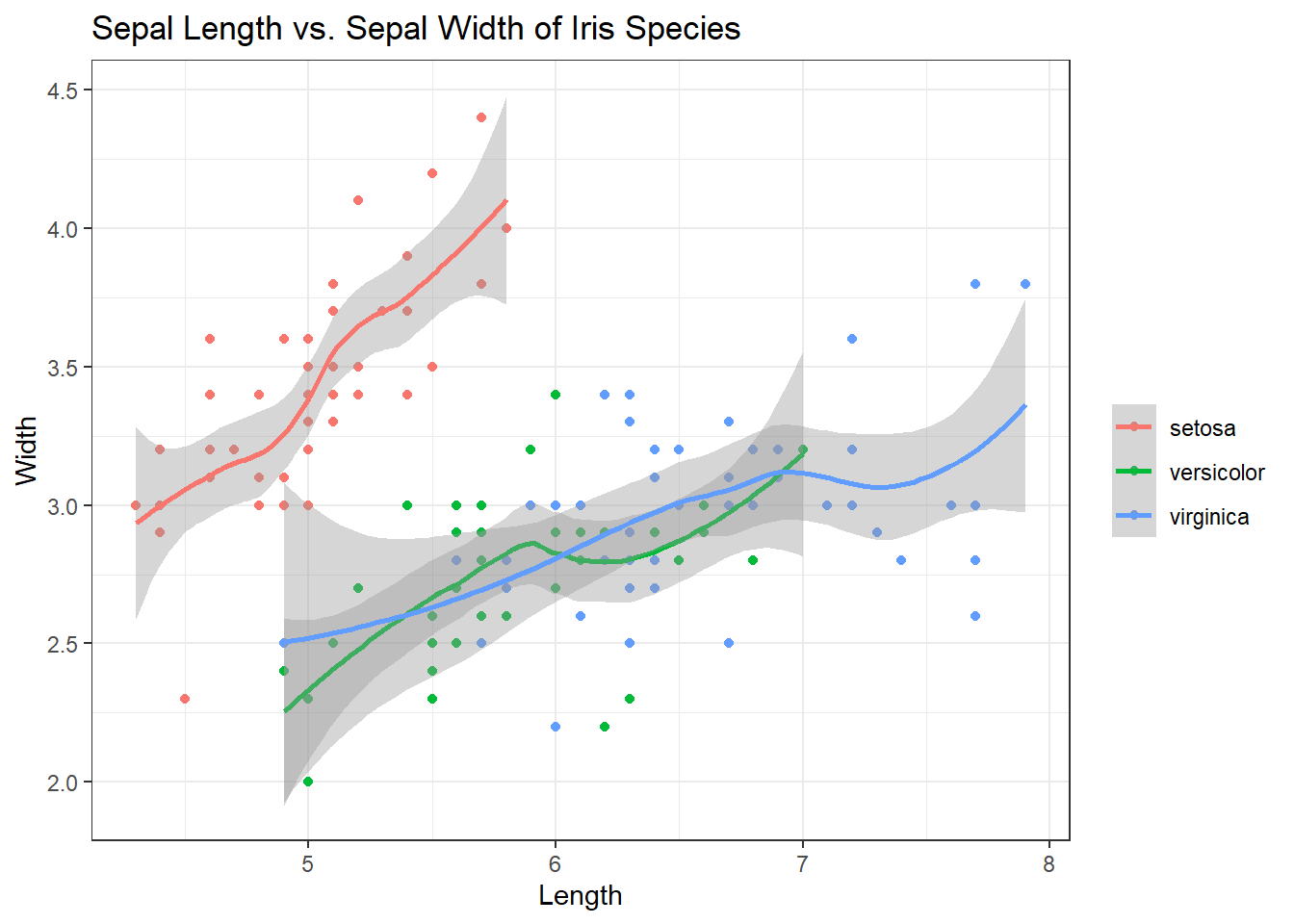
Excellent. The smooth helps us see the correlations and trajectory of those correlations but the grey shading (the error) can be distracting. Inside of geom_smooth(), add se=FALSE to remove it.
ggplot(iris, aes(x = Sepal.Length, y = Sepal.Width, col = Species)) +
  geom_point() +
  geom_smooth(se = FALSE) +  # Adding in the smooth, removing grey
  labs(title = "Sepal Length vs. Sepal Width of Iris Species", x = "Length", y = "Width", col = "") +
  theme_bw()
## `geom_smooth()` using method = 'loess' and formula 'y ~ x'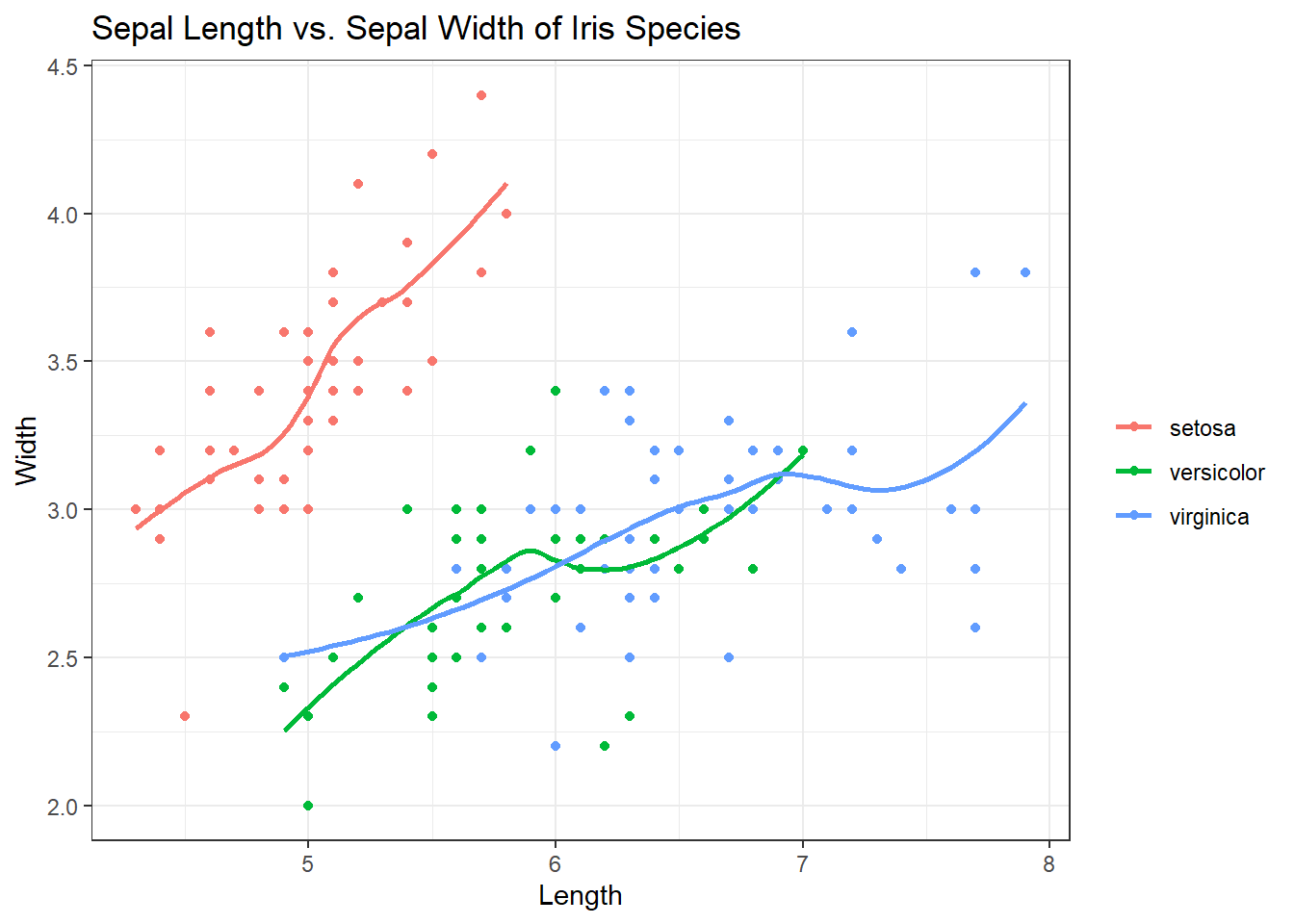
Looks great but let’s say we don’t need the curve in the smoothing lines. We just want them straight. Inside of geom_smooth(), add method = “lm”.
ggplot(iris, aes(x = Sepal.Length, y = Sepal.Width, col = Species)) +
  geom_point() +
  geom_smooth(se = FALSE, method = "lm") +  # Adding in the smooth, removing grey, lines straight
  labs(title = "Sepal Length vs. Sepal Width of Iris Species", x = "Length", y = "Width", col = "") +
  theme_bw()
## `geom_smooth()` using formula 'y ~ x'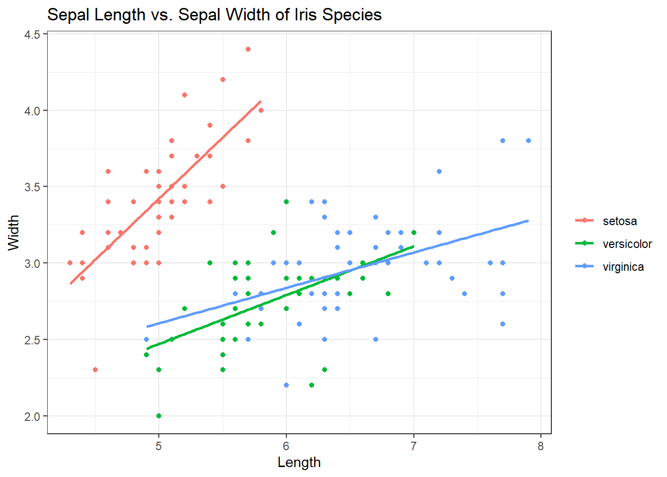
That looks much better to me. But I want the points to be a little more transparent. We can do this using “alpha = x” inside of the geom_point() function. X would be equal to the percentage of the color you want to keep. “alpha = 1” would mean the color stays the same. “alpha = .5” means the colors become more transparent by 50%. Check out the code below:
ggplot(iris, aes(x = Sepal.Length, y = Sepal.Width, col = Species)) +
  geom_point(alpha=.5) + # 50%
  geom_smooth(se = FALSE, method = "lm") +  # Adding in the smooth, removing grey, lines straight
  labs(title = "Sepal Length vs. Sepal Width of Iris Species", x = "Length", y = "Width", col = "") +
  theme_bw()
## `geom_smooth()` using formula 'y ~ x'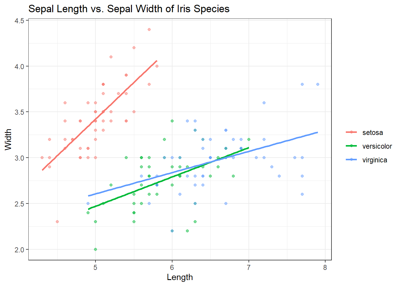
geom_boxplot()
geom_boxplot() creates boxplots. Remember when creating boxplots, the x axis needs to be a qualitative variables. Lets use the iris dataset to view sepal length by species.
ggplot(iris, aes(x = Species, y = Sepal.Length)) +
  geom_boxplot() +
  labs(title = "Making some boxplots!", y = "Sepal Length")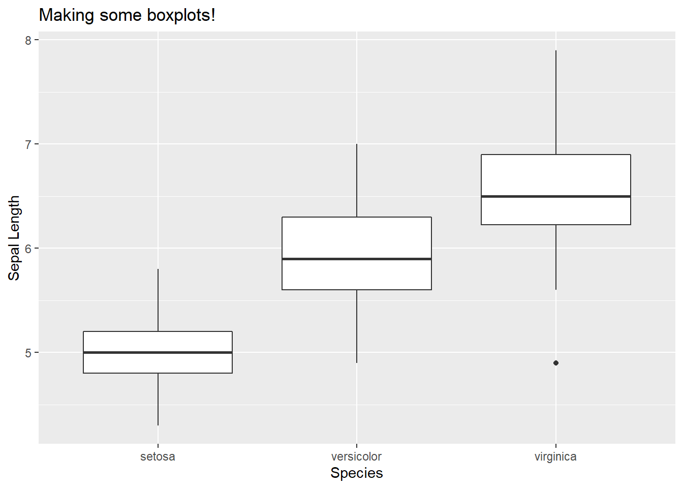
Came out nice but let’s give it a little dazzle.
Check out the code:
ggplot(iris, aes(x = Species, y = Sepal.Length, col = Species)) +
  geom_boxplot() +
  geom_jitter() +   # Look up geom_jitter() on google!
  labs(title = "Making some boxplots!", y = "Sepal Length")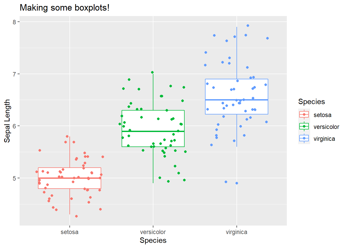
geom_histogram()
Let’s use a dataset called diamonds. This data comes from the ggplot2 package and contains prices and attributes of ~54,000 diamonds. Let’s look at the data.
library(pander)##
## Attaching package: 'pander'## The following object is masked from 'package:terra':
##
## wrappander(head(diamonds, 5))| carat | cut | color | clarity | depth | table | price | x | y | z |
|---|---|---|---|---|---|---|---|---|---|
| 0.23 | Ideal | E | SI2 | 61.5 | 55 | 326 | 3.95 | 3.98 | 2.43 |
| 0.21 | Premium | E | SI1 | 59.8 | 61 | 326 | 3.89 | 3.84 | 2.31 |
| 0.23 | Good | E | VS1 | 56.9 | 65 | 327 | 4.05 | 4.07 | 2.31 |
| 0.29 | Premium | I | VS2 | 62.4 | 58 | 334 | 4.2 | 4.23 | 2.63 |
| 0.31 | Good | J | SI2 | 63.3 | 58 | 335 | 4.34 | 4.35 | 2.75 |
Let’s look at the distribution of prices for each diamond using a histogram. Since our histogram doesn’t need a y axis assigned (the y axis on histograms is the frequency a value (will be called count on our plot) is present in the data), our code will look a little different than before. Let’s take a look:
ggplot(diamonds) + # set up format - aes() will be taken care of below
geom_histogram(aes(x=price)) # specify ggplot action - aes() and our column of interest is specified here. x = column of interest.
ggplot(diamonds) +
  geom_histogram(aes(x=price))
## `stat_bin()` using `bins = 30`. Pick better value with `binwidth`.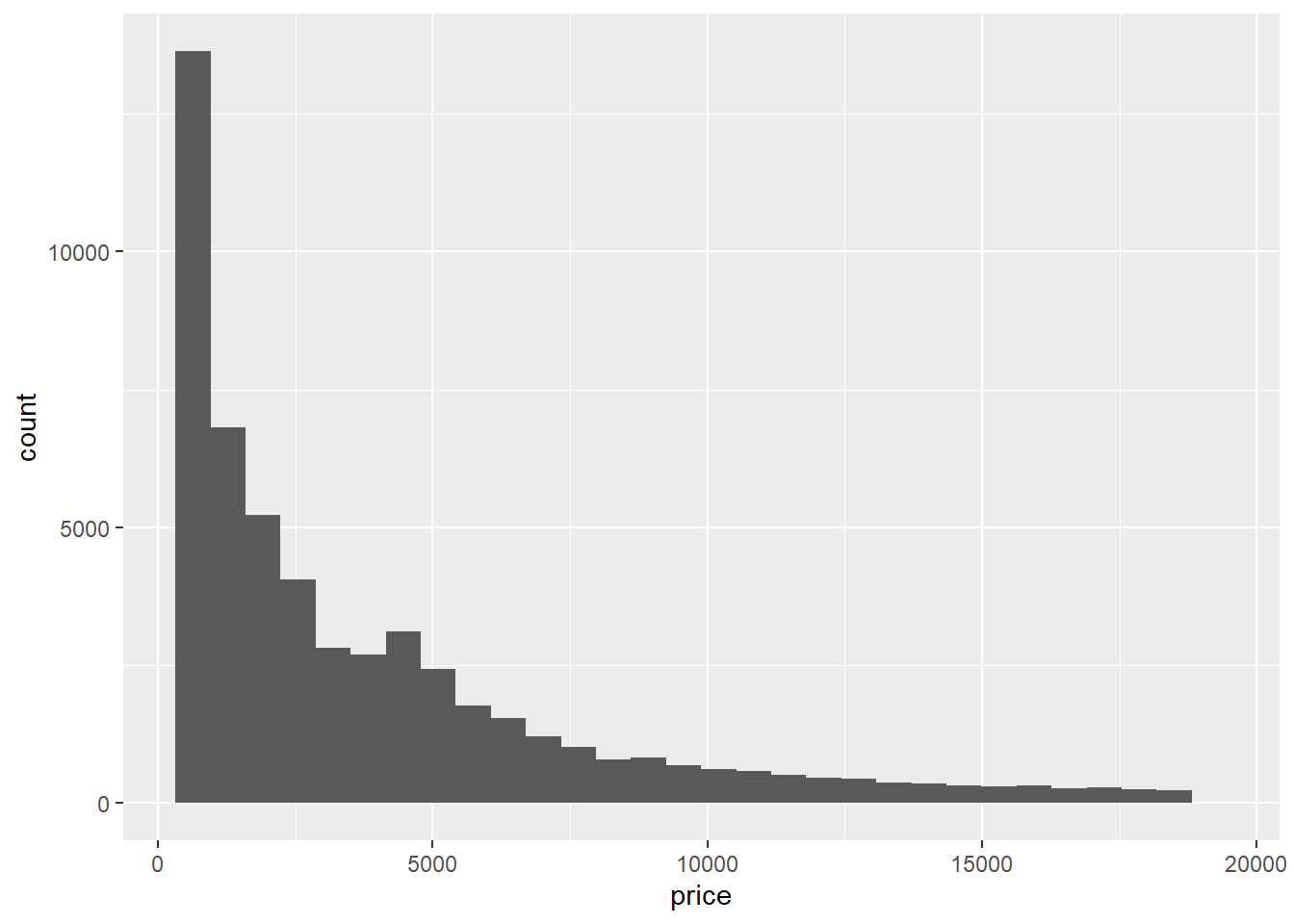
The histogram comes out okay.. It gives us the values and answers our question but it’s pretty bland. Lets look at some of the things we can do to make it look nicer:
You can assign colors to your histogram bins. For example, there are several different diamond cuts that make up these prices. You can specify a color to view the distribution of price for each cut by using fill = class. In this case, it would be fill = cut This will be include inside the aes() function.
We can change the number of bins (30 bins/bars is the default for geom_histogram()) by using bin = number of bins. Lets put 75 bins in our next plot. This will be included outside the aes() function and inside the geom_histogram() function.
We can also change the size of each bin by using binwidth = size of bins. The value of binwidth is on the same scale as the continuous variable on which histogram is built. Changing the binwidth can give either a more/less detailed view of our data. Let’s change our binwidth to 200 by using binwidth = 200. This will be included outside the aes() function and inside the geom_histogram() function.
Let’s give it a go:
ggplot(diamonds) +
geom_histogram(aes(x=price, fill = cut), bins = 75, binwidth = 200) 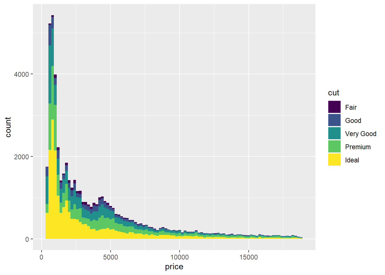
Looks much better! But what is we don’t like the colors? ggplot2 has got that covered by using scale_fill_brewer.
scale_fill_brewer()
The brewer scales provide sequential, diverging and qualitative colour schemes from ColorBrewer, an add in ggplot2 that allows for awesome colors. Click on these links to examine different color schemes: https://colorbrewer2.org/ and https://www.r-graph-gallery.com/38-rcolorbrewers-palettes.html
You can add in different color brewer palettes by using palette = “colorscale of choice”. I personally like using the BrBG (Brown - Blue - Green) palette. Let’s add it in.
ggplot(diamonds) +
  geom_histogram(aes(x=price, fill = cut), bins = 75, binwidth = 200) +
  scale_fill_brewer(palette = "BrBG")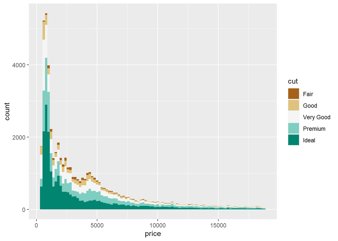
geom_freqpoly()
The geom_freqpoly() function gives us the same insight as a histogram, but instead of bins/bars, it creates lines that follow the distribution of values. Run the same exact code we did above but substitute geom_histogram() for geom_freqpoly() and in aes(), fill = for col =.
ggplot(diamonds) +
geom_freqpoly(aes(x=price, col = cut), bins = 75, binwidth = 200) 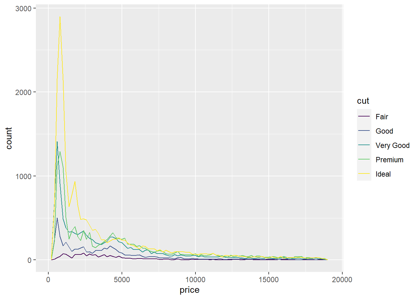
geom_line()
ggplot(diamonds, aes(x = price, y = depth, col = cut)) +
  geom_line()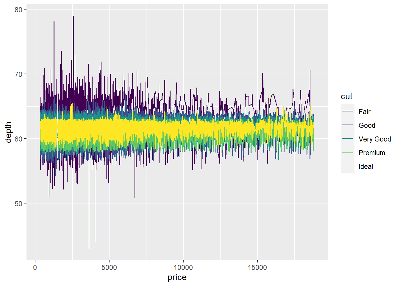
geom_density()
Computes and draws kernel density estimate, which is a smoothed version of the histogram. This is a useful alternative to the histogram for continuous data that comes from an underlying smooth distribution. So in a sense, it is very similar to geom_histogram().
Let’s use our diamonds dataset and view the depth value distribution/density by diamond cut.
  ggplot(diamonds, aes(x = depth, fill = cut)) +
  geom_density()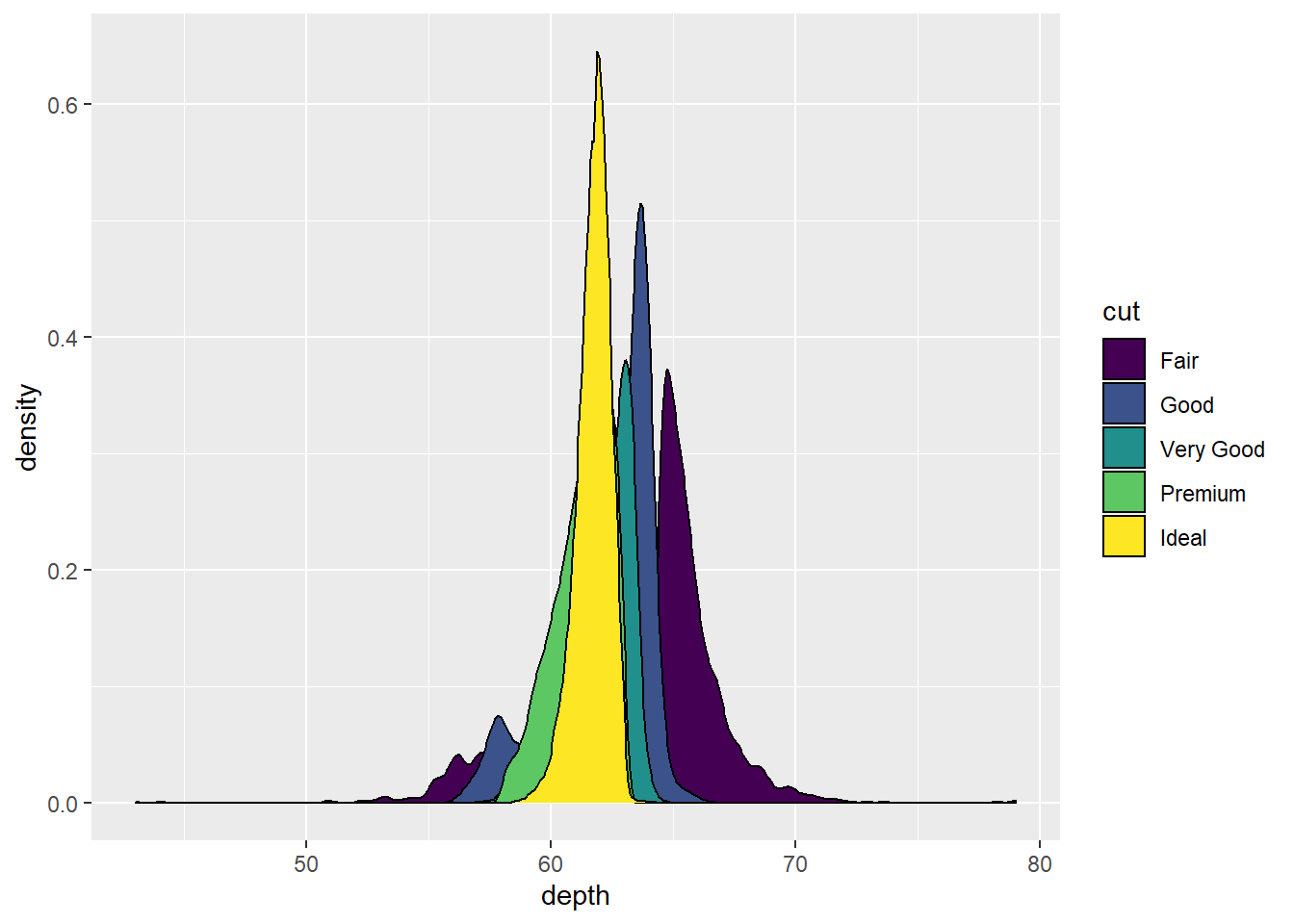
Pretty cool looking. Let’s make the colors transparent to 50% by using alpha = .5.
  ggplot(diamonds, aes(x = depth, fill = cut)) +
  geom_density(alpha=.5) # set transparency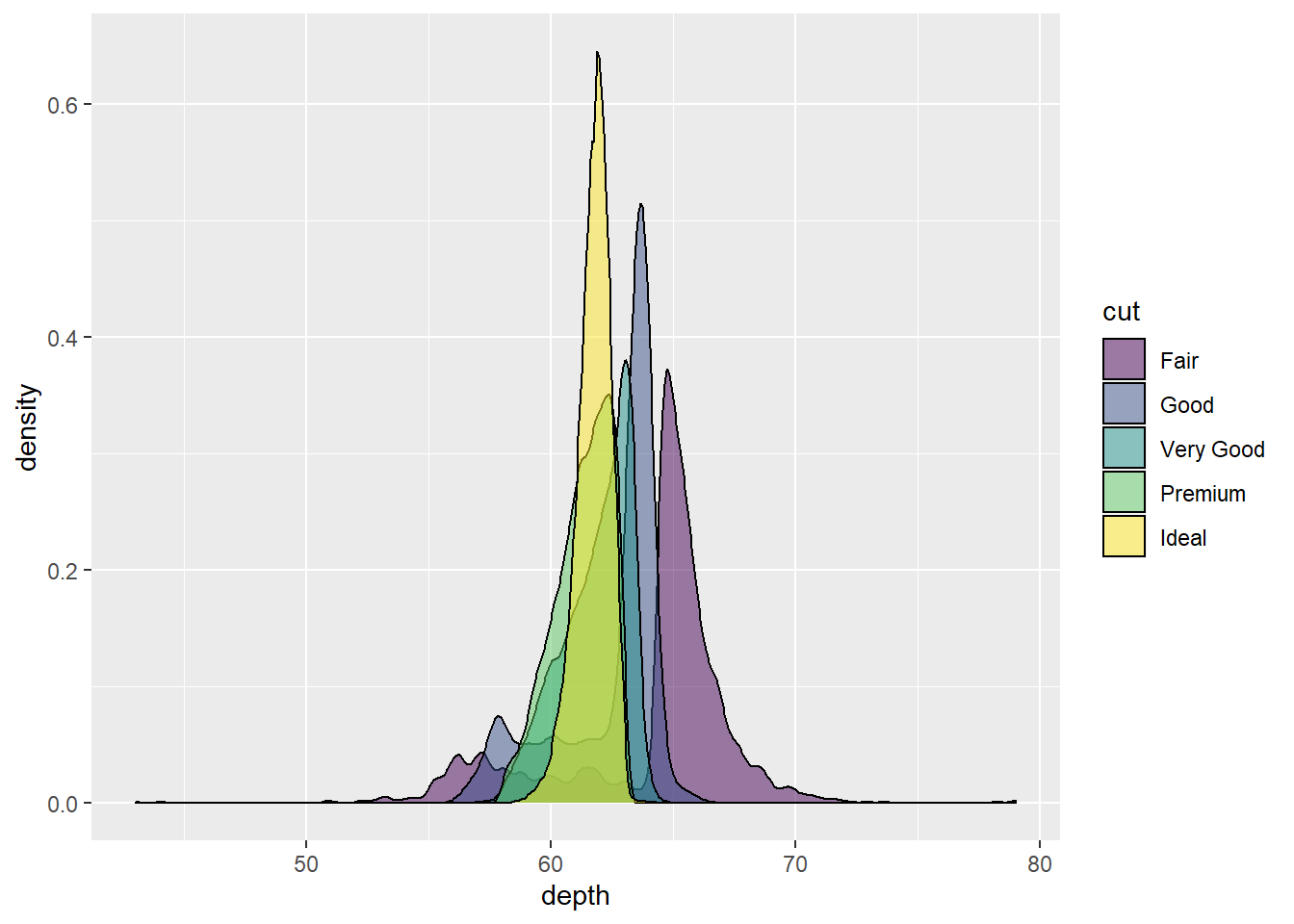
The transparency adds a nice touch. But what if we are mostly interested in depth values from 60 to 70? We can use the function xlim() and set out graph limits on the x axis to only show values between 60 - 70. Check out the code to see how:
ggplot(diamonds, aes(x = depth, fill = cut)) +
  geom_density(alpha=.5) +
  xlim(c(60,70)) # use c() to set the lower and upper limits of our x axis values
## Warning: Removed 5137 rows containing non-finite values (stat_density).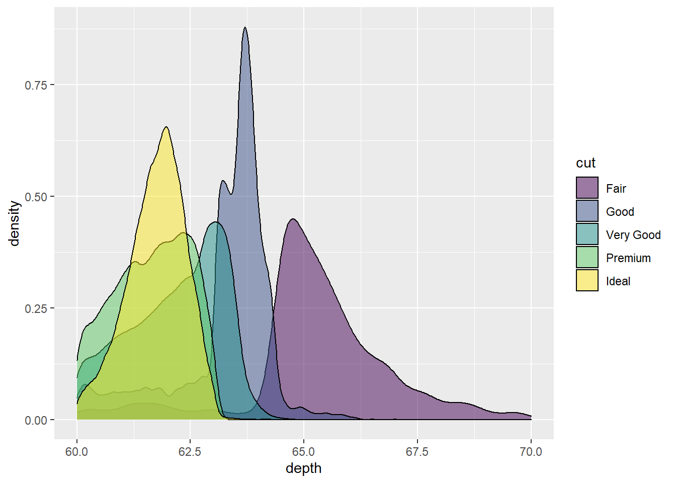
Interactive Plots with Plotly
Plotly allows you to make plotting interactive. It’s also really simple to use.
Install plotly and load the library.
Let’s create a simple scatterplot using our diamonds dataset looking at carat vs. price with colors tied to the diamond cut. We will also assign our plot to the variable ‘G’.
G <- ggplot(diamonds, aes(x = carat, y = price, col = cut)) +
  geom_point(alpha = .5)
G # Run our plot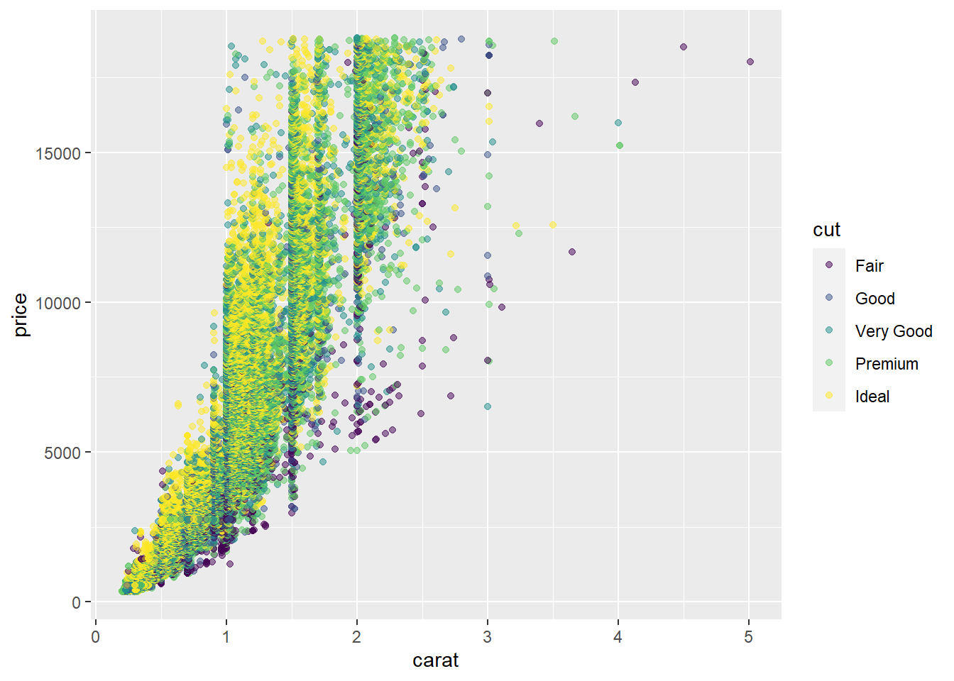
Now let’s use the ggplotly() function on our created variable, ‘G’.
ggplotly(G)The never-ending things to do with ggplot2
As I mentioned in the beginning of thise guide, there are so many things to learn about ggplot. Below are some links to get you inspired:
Bonus Data Wrangling
if-else statements
If else statements are completed through the function ifelse(). It’s just like every other if else statement you have heard of. If it is not this, it is that.
The code is structured like this:
ifelse(data, condition, answer to be TRUE, answer to be FALSE)
Let’s say we have a list of the heights of 10 sweet jumps I did on my bike at the skatepark. These are in inches………… Rad stuff.
5, 6, 3, 7, 2, 10, 9, 5, 11, 3
I want to to make a dataframe with these values AND a column that says if my jump was sweet or not. If it was 5 inches or less, it wasn’t sweet. If it was over 5 inches, you know it was pretty sweet.
Check out the code:
jumps <- c(5, 6, 3, 7, 2, 10, 9, 5, 11, 3)
was_it <- ifelse(jumps >5, "Sweet", "Not Sweet")

badass <- cbind.data.frame(jumps, was_it);badass
## jumps was_it
## 1 5 Not Sweet
## 2 6 Sweet
## 3 3 Not Sweet
## 4 7 Sweet
## 5 2 Not Sweet
## 6 10 Sweet
## 7 9 Sweet
## 8 5 Not Sweet
## 9 11 Sweet
## 10 3 Not SweetFor-loops
a for-loop is a type of control statement that enables one to easily construct a loop that has to run statements or a set of statements multiple times. For loop is commonly used to iterate over items of a sequence. A loop is just a way to repeat a sequence of instructions under certain conditions.
Basically, it allows you to run a function(s) or analysis(es) across many values in a list or data frame.
Here is an example:
Using my jumps data, I want to see the jump height in the percentage of a foot. Then I want to set up those values in a sentence.
Check out my code:
jumps <- c(5, 6, 3, 7, 2, 10, 9, 5, 11, 3)

for (i in jumps){                      # The letter i can be any other letter
  x1 <- i/12                           # I want the inches divided by 12, using i as the jumps
  x2 <- x1*100                         # I want to multiple by 100 for each jump divided by 12
  print(paste("The percent is:", x2))  # I want to paste in a character string, then my values
}
## [1] "The percent is: 41.6666666666667"
## [1] "The percent is: 50"
## [1] "The percent is: 25"
## [1] "The percent is: 58.3333333333333"
## [1] "The percent is: 16.6666666666667"
## [1] "The percent is: 83.3333333333333"
## [1] "The percent is: 75"
## [1] "The percent is: 41.6666666666667"
## [1] "The percent is: 91.6666666666667"
## [1] "The percent is: 25"